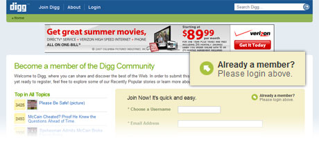
QuickTip Sundays: Digg.com
One of my pet peeves is when I click on a link, I get sent to page that asks me to sign in. Some sites require it, which I understand, but if they do require it, they should make the process as painless and obvious as possible. Digg.com requires a sign in when you submit a new link for obvious reasons: to validate you are an actual user, and to limit spam.
Keep the options in your face
The vast majority of people that come to the page are new users, but I would guess a good percentage are returning users without the cookie saved. Why ask them to go above when sign in can be placed in line right here? It would take up 50, maybe 60 pixels of vertical space, tops, which is more important than losing a user.
Keep the options obvious and limited
Additionally, where it says Top In All Topics, that encourages leakage, meaning users are going to click there when they can’t figure out how to sign in. Just about every usability test I’ve seen regarding web forms is that the more places the user has to click, the more places they are going to click. there are metrics that show the number of people leaving a page were directly related to the number of links on that page.
Keep the forms simple
This registration form requires 12 pieces of information.
Twelve.
That’s great, if you are marketing cars, but this is an internet news site.
This is way too long, especially when the target audience is bloggers, most of whom don’t want to give up this much information. At the very most, digg should only be asking for the user name, email address, a password, and the CAPTCHA. Everything short of the gender and birthday could be assumed from the IP address to a certain amount of accuracy, and if the users really want to add those two, they can do that later or on a second screen.
When the user signs in or registers, return them to the page they were expecting
When I signed in, was I returned to a page where I could enter information about the article?
No.
I was returned to the home page. I have to return to the blog so auto-capture the article information. Not only does this irritate the user who clicked on the link to Digg, but it also irritates the blog owner (me), because I took the time to place a link on the article to promote my blog.
$99 Tough Love Resume and Portfolio Review
Tough love. Great Advice. Receive an one hour portfolio review and career coaching session online, or in person if you're in Seattle.


