What You Should Consider When Optimizing Your Site For Laptops
I’ve been doing a fair amount of work around screen resolutions lately. There’s always the “users don’t scroll” issue (they do), but have you thought about the device they may be using: laptop or desktop? Probably not. And did you realize that it may affect the user experience, because they might not be using a mouse, but may be using a trackpad? Absolutely not.
Laptop vs. Desktop:
- Screen sizes of 1280 by 800, 1440 by 900, and 1366 by 768 are indications the end user is most likely using a laptop.
- The 1200 by 800 is very popular among MacBooks, and the Sony laptop I’m on right now is 1366 by 768.
And something you probably haven’t thought of: laptops have outsold desktops for years.
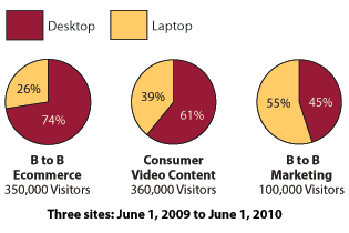
For some sites, the majority of users may be using a laptop.
Forget screen resolutions for laying out the page, think about the indications of device type. Over 34 percent of my blog’s audience is the middle of target laptop screen resolutions. A few other sites I work with have percentages that fall in the 40 to 45 percent range. These percentages alone may be a more important number than browser audience. Seriously, who cares about the box model and CSS issues, when the user can’t figure out how to use the scroll bar?
The Bottom Line
Figure out who your audience is. A website that is aimed at developers (a desktop audience) should be designed differently than a website aimed at sales people (a laptop audience). Consider who they are, and what their environment is. For example consumers are now mostly laptop users and expert users at work use desktops, you want to design for whichever of these two fits your audience.
A lot of laptops are on old technology.
A friend of mine has this laptop that’s four years old.
That might not seem that long, but…
(pause)
(pause)
(pause)
It takes ten minutes to boot-up.
Watching that laptop trying to crank through a website that’s shipping 800k down the pipe for the homepage can be a painful experience. There are millions of laptops and underpowered netbooks out there in the real world, many of them held by consumers that don’t want to migrate their files to a new computer, even if they can afford it.
So they stick with their old, trusty laptop until it dies.
Some reports I’ve seen have shown that 75 percent of the user base is still using Windows XP, which was discontinued two years ago.
That alone shows two points:
- There are a lot of people unwilling to upgrade.
- There are a lot of people on slow computers.
The Bottom Line
Bells and whistles might not be a good thing, when considering your audience. A website that works on a web designer’s souped up MacBook Pro might not be working on an end user’s laptop with 1GB of RAM.
Using a laptop means a different user experience.
That doesn’t mean that they are always using the laptop screen, but what it does mean is they are definitely using the laptop as a web surfing device. This dramatically changes their user experience. Instead of sitting up in their chair, they are looking down at their laptop, typing and using a trackpad.
I had a long conversation with a game developer about the iPad, how people metaphorically see it as a window because they are looking down. Laptops are much the same way. They have to be judged within their environment, whether it is a Starbucks, an airport, or a cubicle when the user is on the run.
Home users might be watching a television show or chatting with friends on Skype, but whatever they are doing, they could be performing multiple actions in an environment that’s not sitting at a desk. Four to seven different application windows may be open, and the browser window will not be expanded.
The margin of 700 pixels becomes 600 pixels. That email you are sending for marketing purposes might only be 300 pixels wide by 600 pixels high.
Another consideration: many popup windows and dialog boxes are designed to be 700 pixels high, which are unusable on netbooks that are 1024 pixels wide by 600 pixels high.
The Bottom Line
Designing for the top left corner of a page is more important than ever before. We might have to rethink always having that branding logo there.
Certain actions are difficult on a laptop.
Get on a laptop and try using it without a mouse. Quite a different experience, right?
Certain actions are assumed to work, like using the arrow keys to scroll through a web page. This is because browser designers have built their applications to work this way. But, there are other actions that are difficult at best and impossible at worst, most of them require holding a button on a mouse — re-size a window, scroll through an editing text area, and perform a multi-select action. These actions require two hands: using the trackpad to scroll while pressing the left trackpad button. Some laptops are missing things. A lot of laptops don’t have page up, page down keys, so the users have to use two keys to scroll down.
A study performed in 2002 found that not only was scrolling 23 percent faster using a mouse versus a trackpad, the error rate for hitting the target was three times higher with the trackpad.
Trackpads change user behavior. Many laptop users, like myself, are experts at hotkeys — so much so that when I’m using a laptop, I use the keyboard more than the mouse. Actions, such as tabbing through a web form, have to work well or it’s useless. Like most gestural interfaces, if you are depending on mouseovers to indicate status, laptop users are going to be missing out on a lot of feedback, because they are trying to perform an action as quickly as possible.
The Bottom Line
Ironically, many of the same concepts around Section 508 compliance also work well for designing for laptop users. Design it so it’s closer to a keyboard-driven application versus mouse-driven application.
Consider Fitts’ law when designing for interactions.
The size of the target, when using a trackpad, makes navigation on certain sites and, more importantly, performing precise actions, hard. To drag-and-drop in a precise manner is impossible using a trackpad. Try navigating Photoshop using one. I guarantee you’ll be be tearing your hair out in five minutes.
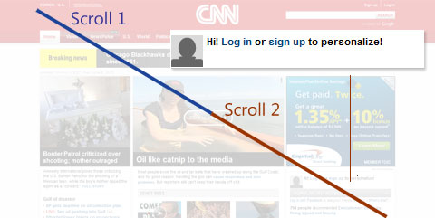
Scroll twice, and hit a target the size of a postage stamp to sign in for personalization — that’s the challenge on CNN.com.
Targets have to be sizable, and dragging the pointer long distances is worse using a trackpad than a mouse. For example, when using a trackpad to go from one end of my screen to another, I have to scroll two separate times from the top left to bottom right corner of my screen. The same works for any direction on the screen for my laptop.
The Bottom Line
Consider distance to take an action and what that action is (for example, a social sign in, which drives a lot of traffic), when designing the page.
$99 Tough Love Resume and Portfolio Review
Tough love. Great Advice. Receive an one hour portfolio review and career coaching session online, or in person if you're in Seattle.


