Form Design And The Fallacy Of The Required Field
 I was on a mailing list today and this came across:
“Use red asterisks — they’re the standard for showing required fields.”
Standards are wonderful; but if I asked my mom what is the international symbol for a required field, she would look at me like I was on drugs (not much different than today, but still).
This was something even the great Jared Spool mentioned as gospel at an event and showed an example in his PowerPoint, which I still haven’t received – but that’s another blog post. He was explaining how another client had used asterisks to show optional fields.
Here’s a few truths about form design that I’ve discovered in my time by testing actual users.
Most forms are hard to read.
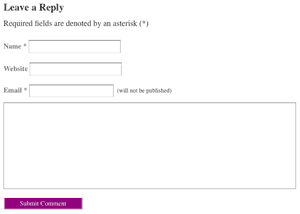
Does anyone find it interesting the note for required fields is after the fields?
There have been a few books and web posts, but for the most part, web form design hasn’t changed that much since 1996. Form fields are left on a white background with a grey line around them. Some sites, like this WordPress blog software I’m using, have a lighter grey line around the form fields for design purposes.
On other sites, form fields are in columns so that they’re next to each other, making the user to really have to work at it.
Given eight form fields, users will fill out all eight.
I’ve run countless of tests and the result in most of them is that users will try to fill out every single form field. This includes the second address field we all know so well even if they don’t have a second address.
Form fields are one of those things that users expect to fill out every single field, because they don’t want to have to figure out error messages when they are wrong. They have been trained that most web forms are ineffective, they do as much work as possible (bad solution number 1) or walk away (worse solution number 2), leaving either a frustrated user, a lost sale or both.
The red asterisk and even the explanation text that reads “Required Fields” are marked as (*). No one’s going to read it.
It’s usually at the top of the form, in line, and all users skip it to dig right in. Users rarely read instruction text, and because most form design is so poorly thought out, users rush through it to make it as painless as possible. Users need visual cues next to the field or at the field they are working on, not 300 pixels, at least, away.
Additionally, the “Required Field” line is usually small and hard to read (read: Designers License), so in the grand scheme of watching users browse the site, they skip right over it.
Solutions to the required field paradox
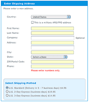
This was a solution we used at Disney Shopping: the word Optional was placed to the right of the field and required fields were colored yellow so users could spot them.
I’m using this particular design pattern on other sites, because at Disney Shopping and a few other sites I’ve worked on, this is the design pattern I’ve enforced. It’s doesn’t interfere with the form because the error messages are usually below the form field, and it’s easy to scan for it.
Why am I enforcing it?
Because, changing Required Fields from the asterisk to this example increases form completions across the board. We’ve tested it, and it works.
Any questions?
$99 Tough Love Resume and Portfolio Review
Tough love. Great Advice. Receive an one hour portfolio review and career coaching session online, or in person if you're in Seattle.


