QuickTip Sundays: Errors And Buttons At Virgin America
One of the forgotten facets of User Experience is that User Experience is everything on the website — the writing, the usability. It’s also if the site works from a functionality standpoint, and if there are system issues that don’t allow the user to complete a task, that’s a poor User Experience.
I ran into an issue at the Virgin America site — I tried to upgrade a seat from a premium to first class at check-in (which, by the way, is only a $50 upgrade on the day of the flight). My friends have been recommending the airline, so I decided to give it a try, because the price wasn’t much different than Alaska.
The issues were:
- The price was wrong
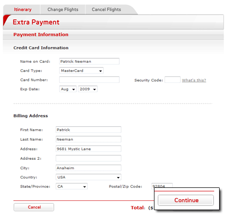
- The payment screen didn’t work well because it had issues automatically populating information if I entered the information wrong and showed a system error
- When I submitted payment, the site timed out
System issues like this are just as frustrating to the user as poor usability; users don’t know why things are going wrong, and sometimes assume that it’s something they did. I don’t know how many times I’ve seen during usability testing where a user would hit reset when hitting a javascript popup dialog.
Testing of a site is especially important if the site is an e-commerce site, like Virgin America, because it directly hits the bottom line. It’s all about ROI, baby.
The one usability issue I saw with the site was the color of the buttons (actually, the lack of color):
That continue button is really hard to spot. I would have made it dark gray (all the positives that color), to move the user along). The placement of the buttons was correct (positive to the right).
I do know that this site was designed by an agency (they were probably built the site also, and most agencies don’t have a lot of technical talent). Sometimes the look of a site should not take precidence over the usability of the site, especially when it comes to buttons.
On a good note, Virgin America honored the upgrade and did a wonderful job with their customer service, and the website had one important link — a mail to — so I could email the issue to their web team. I commend them for doing things the right way!


