QuickTip Sundays: 24 Hour Fitness
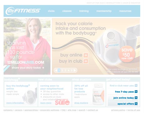
I joined a gym, and did it online. I like the 24 Hour Fitness site because I was able to join online and not deal with any pesky salespeople trying to sell me a plan I didn’t want, and it was a fairly easy process to join. I need notice a couple of items I would change if I were in charge of their website:
Personalization
I came in as a member, and those links showed up. They should be replaced with links that are appropriate to me as an audience. Off that page, I would also make getting to the online store more obvious.
Non-Standard Credit Card And Information Forms
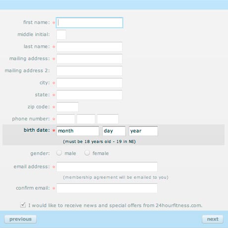
This is the join form, but this also appears in the credit card form — the form required you to enter your month (May, November, September) instead of selecting it from a drop down menu or entering a number. It might seem clever, but every other form of this type I’ve seen has been entering a date as numbers and not as a text item.
You have to really do things people expect, and this is outside the lines. If 80 percent of the forms out there require thing, there better be a really good reason to do it different, and there really isn’t a good reason to do it different here. I wonder: did they do any usability testing?
One note: If you are designing forms for an international audience, the format of the date for most countries is day, month, and year.


