QuickTip Sundays: Alltop
Don’t bury content; give your users multiple ways to view the same information
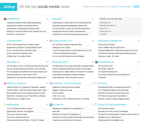
Usability Counts was just recently named as to the Social Media and User Interface topics on Alltop, which is a self-proclaimed “online magazine rack.” While we don’t think we know about as much as anyone else, we’re included in the same page as some of the top blogs out there. So cool. Maybe someday we can can aspire to be Jeffrey Zeldman.
The only issue: we are really, really below the fold. Don’t get me wrong — I like the new design All has launched — but for my own selfish reasons (more traffic, more targeted users, less pooftas), I wish we were a bit higher, and that there was a different way to view content so I could see items by date and not by blog.
How far down is Usability Counts?
Two scrolls down on the 1900 by 1200 monitor we function on for User Interface, and more than five on Social Media. Almost mad dogs and Englishmen tolerance.
Not all is lost: the good news is that AllTop is human-edited i.e. there’s some kind of vetting process on deciding who belongs, and who doesnt. so the spam aspect would be a bit lower, avoiding the torrent of bad posts Technorati delivers to my inbox.
Alltop needs a content view where items are displayed as they are posted (so there’s some encouragement of consistent posting), and maybe a couple others around autority and reputation. 9Rules does a really good job of this, and tends to push more traffic to blogs. A tabbed approach would be a huge benefit to users, and they could set the default of what they wanted to view first.
What do you think?


