QuickTip Sundays: Technorati.com
If you have an action on your site that a user can click on, the page should be primarily around that action
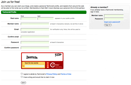
Sorry to pick on Technorati — it’s fun — but one of my pet peeves is when I click on Sign In in the top navigation, this is the screen I get. Over in the right corner, small, is a sign in panel for members to use. For people that clicked on Sign In and didn’t realized they have never been a member of Technorati (and mind you, why would someone click on Sign In if they weren’t a member already?), those users get a huge registration screen where they can create an account.
Users who don’t have accounts that didn’t understand what Sign In means would click on it, thinking they would have the ability to Register. Read that again for emphasis, because it’s supposed to be as confusing as it sounds.
The issue is that both Register and Sign In take the user to the same screen. It was probably a conservation of development resources on the part of Technorati, but I would think they could take the extra week to separate the functions. However, front and center is a registration form. Is it to increase user membership? Is it to confuse existing users?
Keep it simple. If it says Sign In, make that the primary action, and provide a link to the registration screen. Of all the functions that we do over and over again, you would think that registration and signing in (and the design patterns around that) would be fairly straightforward.


