QuickTip Sundays: The Mobile Version Of UsabilityCounts.com
 I’ve been wanting to do this for a while (because I’m sick of trying to view the blog on my iPhone), and it took a while to plan what I wanted to do with it.
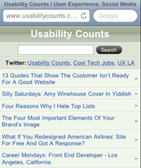
Launched this weekend was the mobile version of UsabilityCounts.com. The home page viewable at mobile.usabilitycounts.com, and i’m working on enabling the whole site at that URL. Most mobile devices should automatically detected and show the right version.
Twitter users that view the site on the iPhone, cheers, and enjoy.
Here’s what I did:
A unique design depending on the device
You can use CSS to handle a different display, but you should do it using server-side technologies, because the whole point of a mobile device is to deliver an experience that has less graphics but is still functional. Delivering a site that is 200k on a limited device with lower than DSL bandwidth doesn’t make sense. To do this, I’ve been slowing ripping apart the TypoXP theme of WordPress for purposes of simplication (most WordPress blogs are overcomplicated in their usage of CSS).
When the site loads, it does an initial detection of the User Agent: Blackberry, Android, iPhone and iPod are the currently supported devices, and you can see a list at Wikipedia. The pages load different content for mobile devices — the web version is heavier, where as the mobile version contains just HTML and a couple of backgrounds and icons for navigation only. WordPress has a set of function calls that makes it easy to show different content depending on how you want it triggered.
I also added the following HTML tag:
<meta name=”viewport” content=”width=480; initial-scale=0.63; maximum-scale=1; user-scalable=0;” />
The iPhone assumes the screen is 960 pixels wide, so there is the new META tag specified called viewport for mobile devices. The iPhone technically is 320 wide by 280 tall in portrait mode, but I set it to 480 pixels wide and adjusted the initial scale to preserve current content. More on that later in the post.
I used CSS style sheet but did not declare it as a mobile style sheet. I would I like to think device manufacturers properly identify their devices, but I know better because I’ve been doing this for too long (and don’t even get me started on Netscape 4.72).
Keep It Simple, Stupid
I did research using other content sites, like the NYTimes application for the iPhone, which I think is one of the best applications on the market. I selected a very similar design approach: allowed for the display of 30 articles at a time, and enabled paging of those articles, and designed around a single column of content.
I figured people were getting very used to scrolling on the iPhone, and designed with that in mind. Common use cases I could see someone reading the site would be while using mass transit or eating lunch.
Once a user was within an article, I kept the same format without the Twitter feed links. Below the article the user could see other recent articles, encouraging browsing of the site. In the future, I’m going to be adding pages where users can view lists of articles by tag.
For the CSS, I avoided a lot of the tricks like hover because they seem pointless in a mobile environment. I figured users would be most appreciative of a simple interface without all the bells and whistles that are reserved for web displays.
Adjust appropriately to use existing content
I planned for a 480 pixel wide maximum width of the content originally for the blog (by no mistake). To make it look good on the mobile device, I had to add 10 pixels of padding around the content. This required adjustment of the viewport values to handle the YouTube and other video content I post in the site.
The values I picked are listed below:
<meta name=”viewport” content=”width=480; initial-scale=0.63; maximum-scale=0.63; user-scalable=0;” />
Initial scale was set below two-thirds because I wanted the videos and image content to scale within the window. YouTube supports the iPhone well. When you select one of the videos, the site is automatically launched. The CSS type is set bigger to account for the initial scale, thus I can use all of the existing content without changing it for those using web browsers.
Make targets big
Dan Saffer writes about this in the book Designing Gestural Interfaces, but I’ll explain it in English: Most people have fat fingers, so it’s a good idea to have fat targets.
Dan advocates the target area be at least one centimeter square, so I adjusted the UI appropriately, including larger than normal search boxes, comment boxes, and the links to the articles are quite a big larger than most websites.
Test on the official manufacturer simulators
The good news is that Apple and Blackberry have applications to test the emulators on. The bad news is that you have to sign up for their programs (which you can do for free) to download the simulators. The Apple iPhone Simulator comes part of the xCode package, so it’s quite a download. Once you have installed it, it’s great at simulating the experience of a website on an iPhone.
Most of the “free” simulators aren’t very effective and don’t give a true experience, so I limited it to using the official iPhone application. I also tested the site on my iPhone, and there was no difference.
Once I get the Blackberry simulator installed, I’ll give you the results. I’m still having difficulties.


