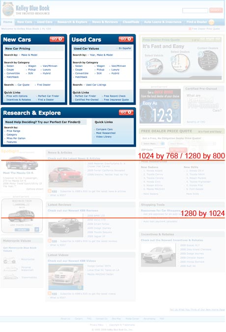
QuickTip Sundays: Kelley Blue Book
Search Panels Should Be Designed With Economy
In the upper left corner, there’s a huge search panel that contains all kinds of ways of filtering for car listings. While I’m all for showing as many options as possible. This area could be reduced by at least 50 percent by adding drop down menus and AJAX-style selection to get the user where they want to go. Some of the contextual navigation (finding a dealer, finding a car) could be mixed in differently.
Designing Above The Fold
Kelley Blue Book is an advertising-driven site, so the value isn’t only their ratings for cars, but driving users to the editorial content on the site. Most of the interesting content is buried low on the home page, and because most users are going to the site for finding a used car price range, they will never see the article content. I would actually suggest that searching for a car price might be placed below some editorial content (but screen centric) to see how it tests in A-B testing.
$99 Tough Love Resume and Portfolio Review
Tough love. Great Advice. Receive an one hour portfolio review and career coaching session online, or in person if you're in Seattle.

