QuickTip Sundays: Mac And Jac
The navigation should be obvious enough that if you’re standing five feet from the monitor, you can distinguish it
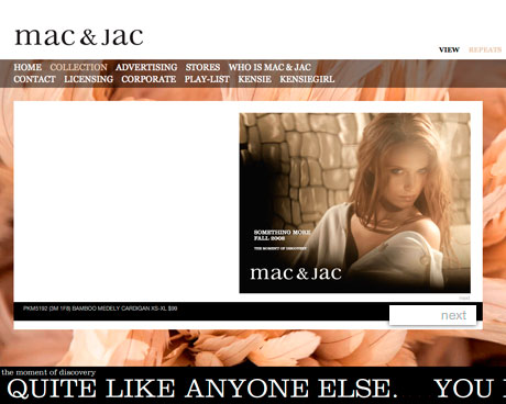
I’m not above picking on sites of companies where I know the people that work there, so I know someone that works at this company. Mac And Jac is a clothing line targeting women aged 25 to 44; the company is based in Canada, and is part of Liz Claiborne. The site and photography is very attractive (I’m a black and white kind of buy), but the one issue I could not figure out was how to navigate through their collection until I saw the “next” link in light grey, as highlighted in the screen shot above.
Where I work at, we had the same issue with a client: they wanted to make all their links grey without an underline.
I’m not against style, but there should be an arrow (or something) indicating navigation links, and it should be easy to read. Navigation points are exactly that: links or other items that allow users to easily distinguish where to go next. If you can’t read next, you can’t go anywhere, right?
$99 Tough Love Resume and Portfolio Review
Tough love. Great Advice. Receive an one hour portfolio review and career coaching session online, or in person if you're in Seattle.

