QuickTip Sundays: Avoid Unnecessary Navigation For Long Articles
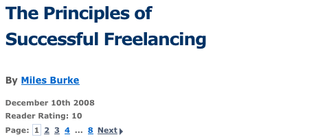
I came across this post on SitePoint, and noticed the page navigation. Eight pages. I have a few articles that should have been broken up into a few pages, and this article could have been condensed (how much can you say about successful freelancing?).
The main reason it was eight pages, it seems, is that there’s a poster ad on every page.
Users.
Hate.
This.
There’s a good chance very few people actually made it the eighth page.
This could have been a several part series — keep bringing the users back — or there could have been some editing. Users don’t mind scrolling if there’s some payoff, or the content in engaging. Gauge the content first, to see if people actually want to read it, and see if there’s ways you can break it up other than paging it like this.
$99 Tough Love Resume and Portfolio Review
Tough love. Great Advice. Receive an one hour portfolio review and career coaching session online, or in person if you're in Seattle.

