QuickTip Sundays: Online Marketing Summit And Be Extremely Clear What The Website Is About
Online Marketing Summit is one of my clients, and I’ve been working with them on doing some slight changes to redesign their site. The base design was very attractive and functional; we’re going through the process of making improvements to make the site more usable and effective. The Online Marketing Summit has a very strong core audience, but they need to reach out to new attendees in regional markets that could benefit from these networking and educational events.
How did we attempt to make it extremely clear?
It’s called Online Marketing Summit for a reason
Just the title alone is a great draw.
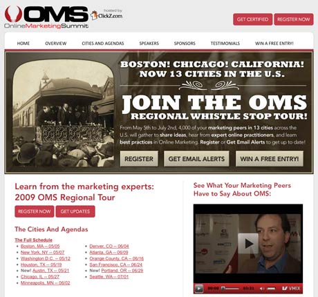
It’s a long company title (and even longer URL), but there’s no question the people that get to the site are potential attendees, which in other words guarantees targeted users. It’s not clever, it’s not cute, it just states exactly what the event is about: online marketing. The partnership with ClickZ adds extra credibility because they are a website that’s very popular with online marketing professionals.
Som websites use a motto or a headline that’s way too vague — most of the time, it’s just better to say exactly what the product or event is, and how it will benefit them.
The navigation at the top of the site clearly states this is an event. “Cities and Agendas”, “Register Now” and “Speakers” doesn’t make it seem like an e-commerce site, that’s for sure.
Use headlines that clearly state why an attendee would want to go
The headlines and each action item we used were:
- What: Join The OMS Regional Whistle Stop Tour
- Why: Learn from the Marketing Experts
- How: “Next Steps”
- When and where: Event cities and dates
Additionally, we emphasized particular words in the main call to action graphic (“best practices”, “expert online practitioners”, “share ideas”, “marketing peers in 13 cities”) that may attract attention. Sometimes content gets lost in the mix, so emphasis of certain words helps the user scan content. Don’t over do it though.
Call to actions are very clear and allow for active or passive participation
All of the call to actions were labeled with active words (“Register Now”, “Get Updates”, “Get Certified”, “Win A Free Entry”) that allowed the user either to be active about signing up (“Register Now”) or passive that they can sign up later (“Get Updates”, “Win A Free Entry”).
According to some of the event companies, almost 75 percent of their entries for events come in the two weeks prior to the event, especially for regional conferences. Capturing the passive audience is very, very important; they will need to be reminded to be attend.
This target audience is a marketing group, so they don’t mind the site being junked up with a few extra call to actions as long as it’s effective and designed well. That’s important, knowing your audience.
$99 Tough Love Resume and Portfolio Review
Tough love. Great Advice. Receive an one hour portfolio review and career coaching session online, or in person if you're in Seattle.

